Brand book · 2026
How Serpio looks, sounds, and holds together.
Serpio writes search content for founders who would rather build. This is the identity behind it — one mark, one indigo, two typefaces, and a voice that refuses to sound like the content it replaces. It is public so that anyone building with us can get it right.
01 · Logo
A delta, with the S left open.
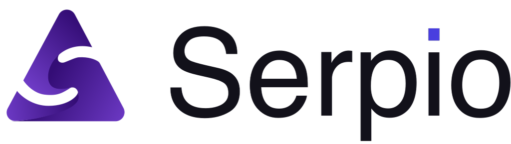
A delta — the climb — built from three overlapping shards, with an S left open between them. The S is not drawn: it is the gap the shards leave, which is why it holds in one colour and on any background.
The same indigo that lights the tittle of the “i” in the wordmark ties the two halves together.
Mark
Avatars, loaders, tight mobile nav. Minimum 20px.
Wordmark
Only when the mark already appears nearby.
Inverted
Shards collapse to solid white on dark. The S survives — it is the gap, not a fill.

Tile
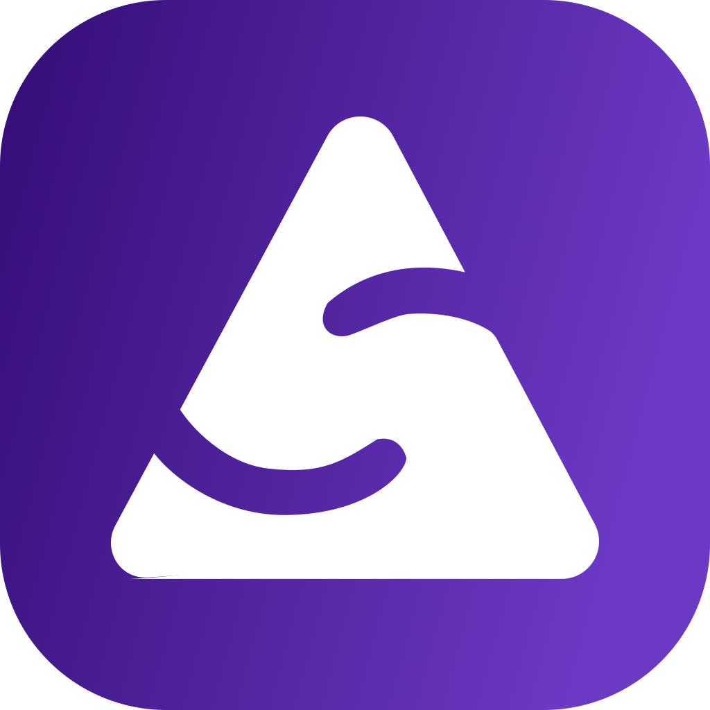
The only form of the mark for backgrounds we don't control — browser tabs, app stores, social avatars. Purple squircle with the delta in white.
One colour
Print, stamps, embroidery. One ink is enough, because the S is negative space.
Construction
Supplied as artwork on a 458 × 525 artboard and used as drawn — the only edit was a zero-area spur removed from the middle shard's outline. Everything on this page is fitted from those bounds, so the mark is never redrawn by hand.
- Artboard
- 458 × 525
- Mark bounds
- 368.3 × 348.9
- Shards
- 3, overlapping
- Gradient
- #340D76 → #6C39C4
Clear space
A fifth of the mark's height on every side. Nothing enters it.
Minimum size
Lockup 22px · Mark 20px · Tile 16px. Below 20px, use the tile.
Lockup
Mark 40 tall, 12-unit gap, wordmark at 28-unit cap height. Ratio 156 : 44.
The name
Serpio. One word, capital S. Never Serp.io, SerpIO or SERPIO. Said “SERP-ee-oh”.
Misuse
Everything below has shipped somewhere at some point. None of it should again.
Don't stretch or squash
Don't recolour the delta
Don't rotate the mark
Don't box the bare mark
- Serpio
Don't put the name in a live font
- Serp.io
Don't bring back the period
Don't fill in the S
Don't use it on busy backgrounds
02 · Colour
Off-white, layered. One indigo, held back.
The palette is a crisp, cool off-white punctuated by a single high-conviction indigo. Structure comes from tonal shifts between surfaces, not from lines — so the indigo has nothing to compete with when it does appear.
Signature gradient
#3525CD → #4F46E5, 15°
Primary CTAs, hero-level backgrounds and the top row of the mark. Always this angle, always these two stops.
The no-line rule
No 1px borders for sectioning. A table sits on surface-low inside a page on surface; the shift is the boundary. If accessibility demands an edge, use outline-variant at 15%.
Brand
One hue, three depths. Indigo is the only colour the identity owns.
- #3525CD
primary
Core brand. Gradient start, focus rings, the top row of the mark.
- #4F46E5
primary-light
Buttons, links, active states. Gradient end.
- #C3C0FF
primary-dim
Selected chips, soft highlights, tinted backgrounds.
- #58579B
secondary
Supporting text on indigo tints, muted labels.
- #B6B4FF
secondary-container
Secondary fills and tags.
Surfaces
Depth comes from stacking these, never from borders. Each layer is one step lighter than the one below.
- #F9F9F9
surface
Page ground.
- #F3F3F3
surface-low
Sectioning bands.
- #FFFFFF
surface-lowest
Cards that need attention.
- #EEEEEE
surface-container
Inputs at rest, chips.
- #E8E8E8
surface-high
Secondary buttons.
- #DADADA
surface-dim
Disabled, dividers-by-tone.
Ink
Text and line colours. The logo uses its own ink, a touch bluer than body text.
- #1A1C1C
on-surface
Headlines and body.
- #464555
on-surface-variant
Secondary copy.
- #777587
outline
Captions, placeholders, icons.
- #C7C4D8
outline-variant
Ghost borders at 15% when one is unavoidable.
- #12111A
logo ink
Wordmark and mark rows only.
- #111827
footer
The one dark surface. Inverted logo lives here.
Semantic
State colours are not brand colours. They never appear in the identity.
- #BA1A1A
error
Failures, destructive actions.
- #FFDAD6
error-container
Error backgrounds.
03 · Typography
Manrope for the headline. Inter for everything that has to be read.
Two faces, two jobs. Manrope carries the editorial voice in headlines — bold, slightly condensed, tracked tight. Inter does the work underneath: dense dashboards, long articles, labels at 11px. Neither is ever used for the other's job.
Aa
Display · Manrope
Bold (700) and ExtraBold (800) for display; SemiBold (600) for section headlines. Tracking −2% at display sizes. Give it room — 64px of clearance below a display headline is the floor, not the ceiling.
ABCDEFGHIJKLMNOPQRSTUVWXYZ abcdefghijklmnopqrstuvwxyz 0123456789
Aa
Body & UI · Inter
Regular (400) for body, Medium (500) for buttons and labels, SemiBold (600) for uppercase micro-labels with +11% tracking. Tabular numerals wherever figures line up.
ABCDEFGHIJKLMNOPQRSTUVWXYZ abcdefghijklmnopqrstuvwxyz 0123456789
Scale
- display-lg3.5rem · Manrope 800 · -0.02em
Position one, by morning.
- display-md2.5rem · Manrope 700 · -0.02em
Written from your docs.
- headline1.5rem · Manrope 600 · -0.01em
Internal links, placed automatically
- body-lg1.125rem · Inter 400
Overnight, Serpio drafts a 2,000-word piece from your own docs and links it to pages you've already published.
- body0.9375rem · Inter 400
Scored 88 for Google. Waiting in your WordPress drafts.
- label-md0.8125rem · Inter 500
Publish · Schedule · Regenerate
- label-sm0.6875rem · Inter 600 · 0.11em
GEO SCORE · 91
04 · Voice
Say what it does. Then show it.
Serpio sells against generic AI content, so the brand cannot sound like it. Every headline, tooltip and error message is written the way a founder would explain it to another founder over coffee — specific, a little dry, and honest about limits.
Plainspoken
Short words, concrete nouns, real numbers. If a sentence could sit on a competitor's site unchanged, cut it.
Founder to founder
We're building this too. First person plural, no corporate distance, no 'users' — people, founders, you.
Show the mechanic
Grounding, linking, scoring. Name the step and show the output. The product is the proof; adjectives aren't.
Anti-hype, anti-slop
Serpio exists because generic AI content is slop. Our own copy is held to the standard we sell.
Not this
This
Revolutionary AI content platform that 10×s your growth.
A new article on your blog tomorrow. Written while you built the product.
Leverage cutting-edge LLMs for SEO-optimized content at scale.
Drafts a 2,000-word piece from your own docs, links it to pages you've already published, scores it 88 for Google.
Seamlessly integrates with your entire publishing ecosystem.
Publishes straight to WordPress. Framer, Webflow and Ghost get a clean copy-and-paste.
Unlock unlimited possibilities for your brand.
Three articles a month, free. No card.
Banned words. Revolutionary, seamless, leverage, unlock, supercharge, 10×, game-changing, AI-powered (as a benefit).
Numbers over adjectives. “2,000 words”, “scored 88”, “by 7am” — not “long-form”, “high-quality”, “fast”.
Buttons say what happens. “Publish” → toast: “Published.” Errors say what broke and how to fix it. No apologies, no vagueness.
05 · Design principles
The Digital Architect.
The creative north star for everything Serpio ships: absolute authority, radically accessible. Soft minimalism with high information density — extreme whitespace, tonal layering, and a hierarchy driven by type weight and surface rather than lines.
01
Layer, don't outline
Treat the interface as stacked sheets: surface, surface-low, surface-lowest. Boundaries are tonal. Where something must float, the shadow is a lift, not a drop — 0 12px 32px at 6% of the ink colour.
02
Editorial, not template
Asymmetric 60/40 splits. Mockups that bleed out of their container. Hierarchy from weight and background, not from rules and boxes. It should read like an intelligence report, not a SaaS dashboard.
03
Dense, but breathing
Dashboards carry a lot of information. Keep 32–48px around every data cluster and separate list items with 16–24px of space instead of divider lines.
04
The product is the picture
Primary visuals are clean, simplified UI mockups — a score, a draft, a link graph — at the system's 8–12px radius. No stock photography, no abstract 3D blobs, no generic icon packs. Icons are thin-stroke and drawn for the job.
Primitives
Primary: gradient, 8px radius. Secondary: surface-high, no border.
Inputs: surface-low at rest, white with a 20% primary ghost ring when active.
Chips: surface-high unselected; primary-fixed with on-primary-fixed text when selected.
06 · Assets
Take the files, not a screenshot.
Every logo variant as a clean SVG, plus a transparent PNG at 1024px for anywhere that won't take vector. Both are generated from the same artwork the site renders. Writing about Serpio, listing us somewhere, or putting us on a slide? Use these and the rules above, and you don't need to ask.






Using the name
Refer to the product as Serpio and the site as tryserpio.com. Please don't alter the files, combine the mark with your own logo, or imply endorsement. Questions: contact us.